Work

Scatec

Scatec logo new identity made by Design Container
Client
Scatec
Solution
Recasting a solar energy provider as a renewable energy company using an innovative digital strategy

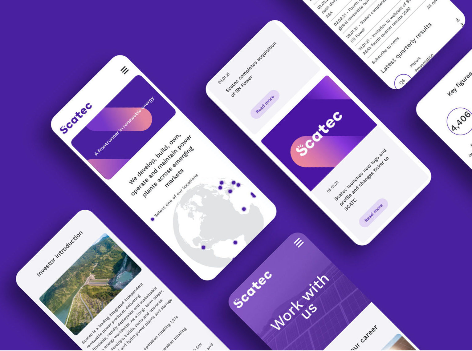
In 2020 Scatec Solar, a leading global solar energy provider, broadened its strategy. After acquiring SN Power it undertook its greatest expansion since the company’s formation. This required a total rebranding and an update of all communication channels. This challenge was entrusted to Stem.

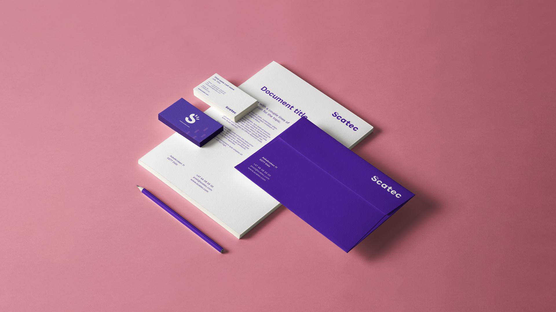
Being a publicly traded company, precise and timely communication was key. Working within a limited timeframe, we wanted to build on the company’s outstanding brand recognition and reputation as a reliable provider and excellent employer, while at the same time charting a totally new direction. The new identity retains the Scatec name, but also showcases a bold changemaker and a frontrunner in the renewable energy sector.

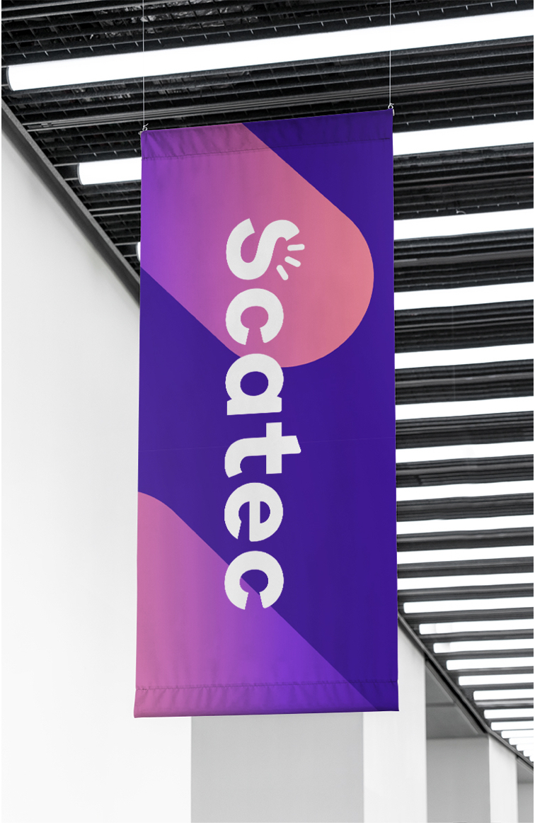
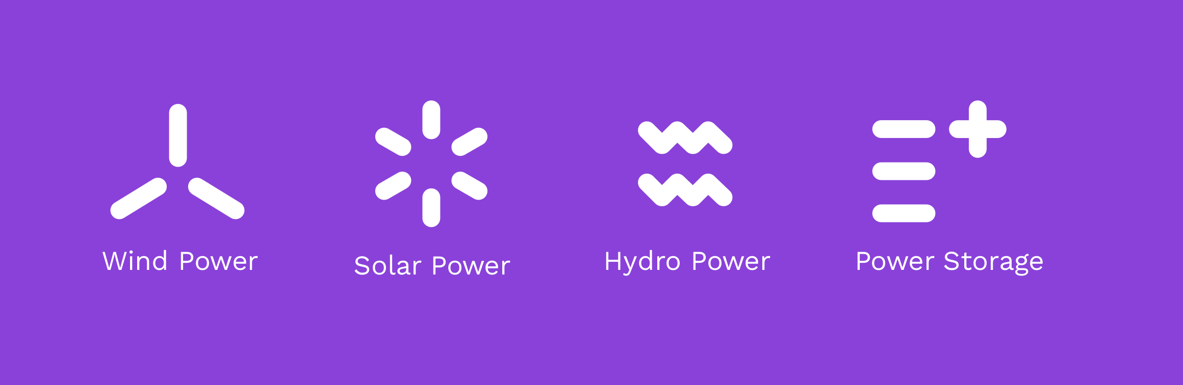
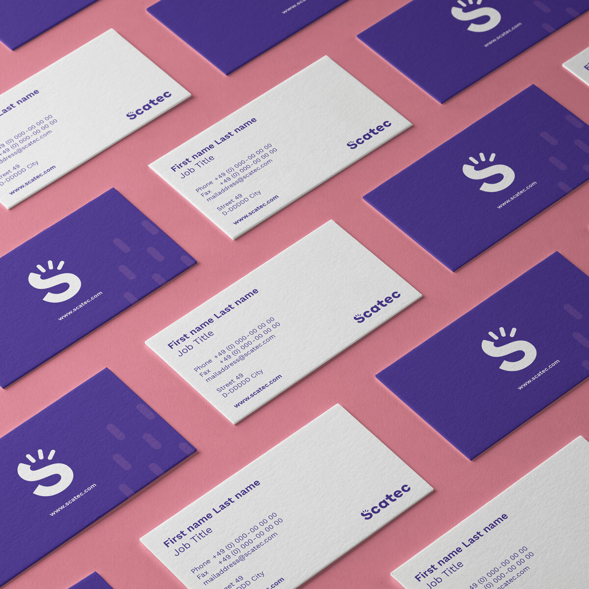
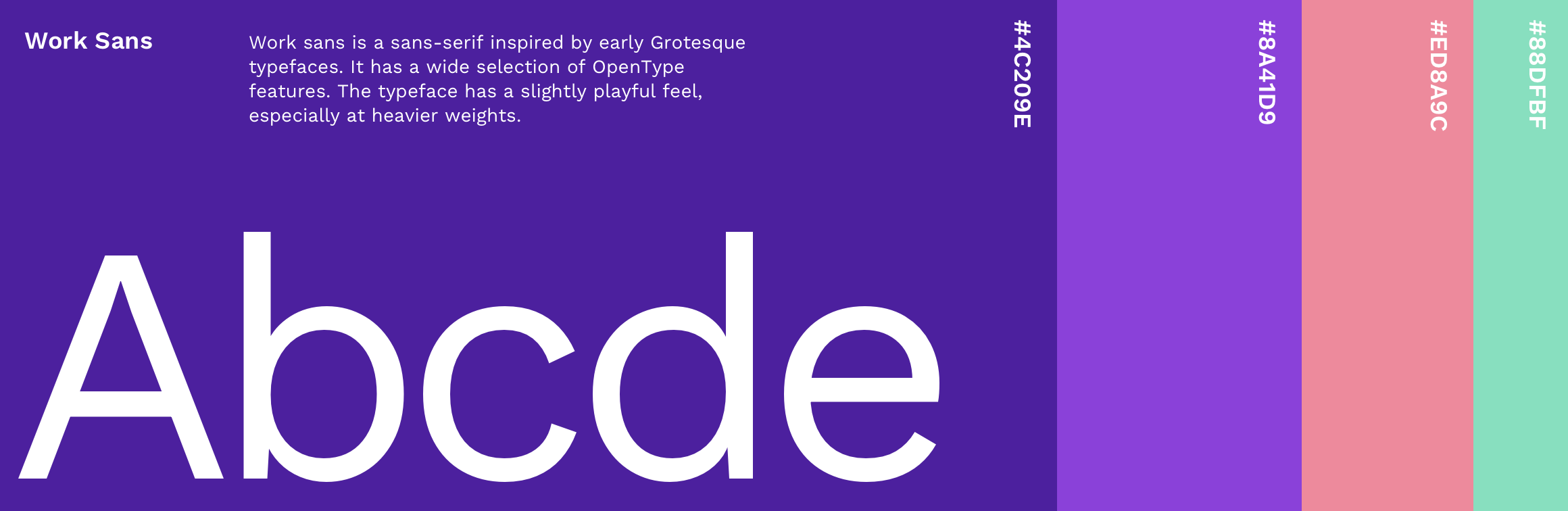
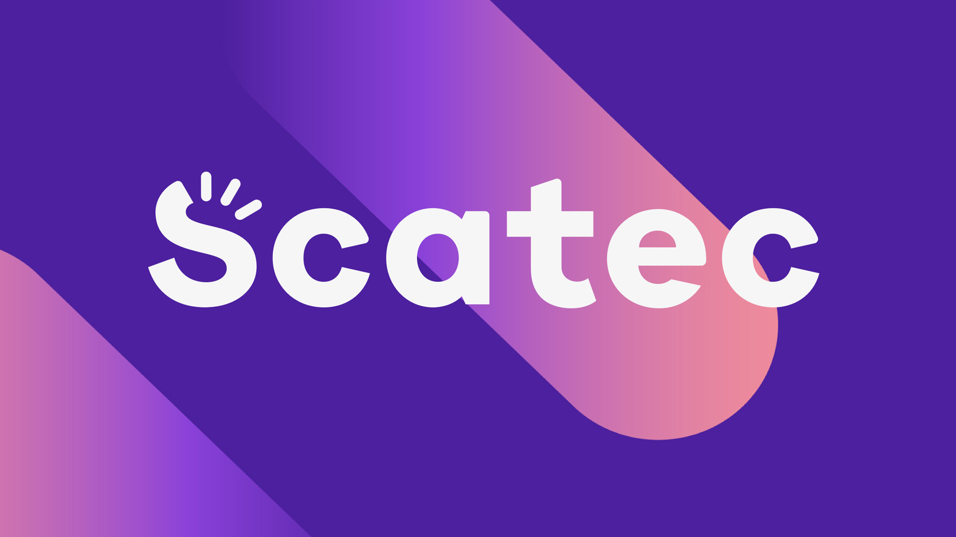
The visual identity and concept are inspired by the natural elements as power sources. Focusing on a strong digital presence, we chose warm, vibrant colours that felt energetic, preformed well on the web and were daring enough to stand out from corporate counterparts. The Scatec logo itself is clean, solid and energised – with the top curve of the capital S broken up into the small sections that are used throughout the brand’s static and animated design elements.

Being a publicly traded company, precise and timely communication was key. Within a timeframe of six months, critical decisions about retaining the company’s name, colours and other elements needed to be made. The name Scatec is widely known in the industry as a reliable provider of solar energy and as an excellent place to work. It enjoys huge brand recognition in the industry as well as an outstanding reputation. We wanted to retain all these aspects while charting a totally new direction for a renewable energy company working with solar, water and hydro energy sources. The new identity showcases a bold changemaker and a frontrunner in the renewable energy sector.

The visual identity and concept take inspiration from natural elements as a power source. Energy/power is everywhere and is always in motion. We wanted the identity to work alongside and illustrate the natural flow of energy. Design elements represent the movement of energy in nature. We developed a set of design elements for the logo itself that morph into the symbols for solar, wind and hydro. The elements morph into patterns that reflect the intensity of natural energy in its speed and motion.

Scatec has an important digital presence – which is why we chose vibrant colours that feel energetic, preform well on the web and dare to stand out from the crowd. We also wanted to distance the brand from its usual corporate counterparts by using a warm colour palette that is both positive and optimistic. The colours and the graphic elements together create a distinct positioning in the market and ensure taht Scatec is recognisable in any context.

Powered by the elements, Scatec is a brand that is not afraid to show that it is on the move. The Scatec logo itself is clean, solid and energised – with the top curve of the capital S broken up into the small sections that are used throughout the brand’s static and animated design elements.

Scatec is a global leading renewable power producer, delivering affordable and clean energy worldwide. As a long-term player, Scatec develops, builds, owns and operates solar, wind and hydro power plants and storage solutions. Scatec is headquartered in Oslo, Norway, and listed on the Oslo Stock Exchange under the ticker symbol ‘SCATC’.