- Client
- Ruter
- Solution
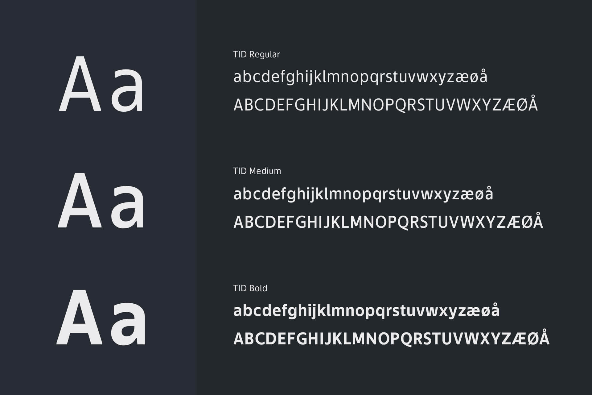
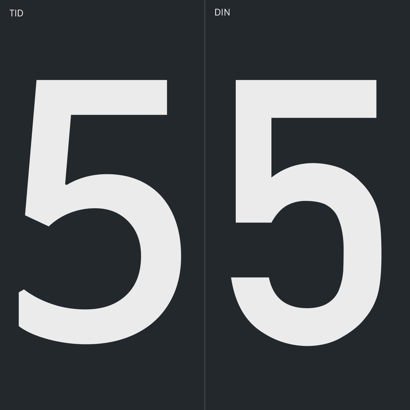
- TID: A new typeface to complete Ruter's visual appearance
Ruter is a joint management company for public transport in the rapidly growing Oslo metropolitan area, in effect handling more than half of all public transport in Norway.
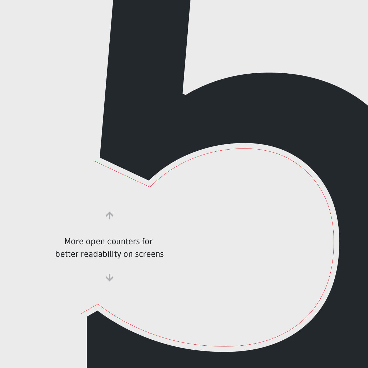
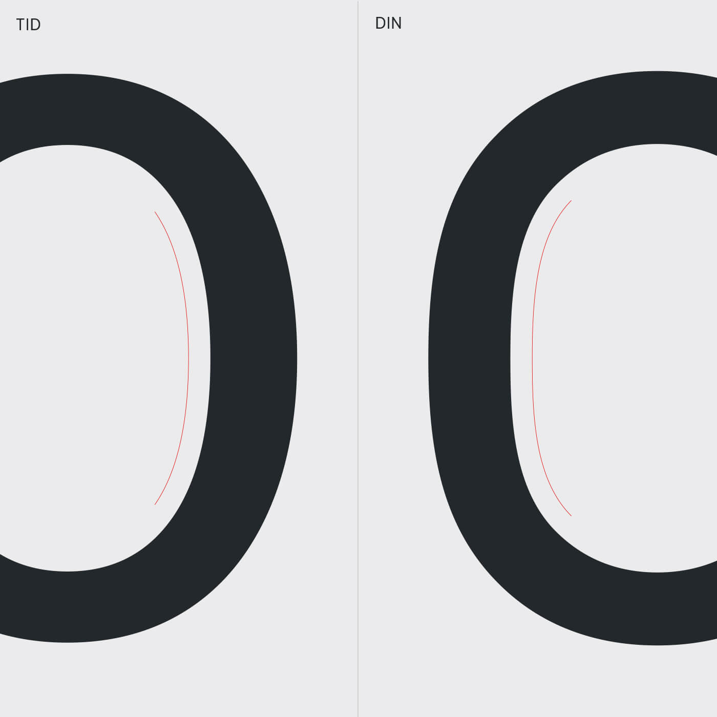
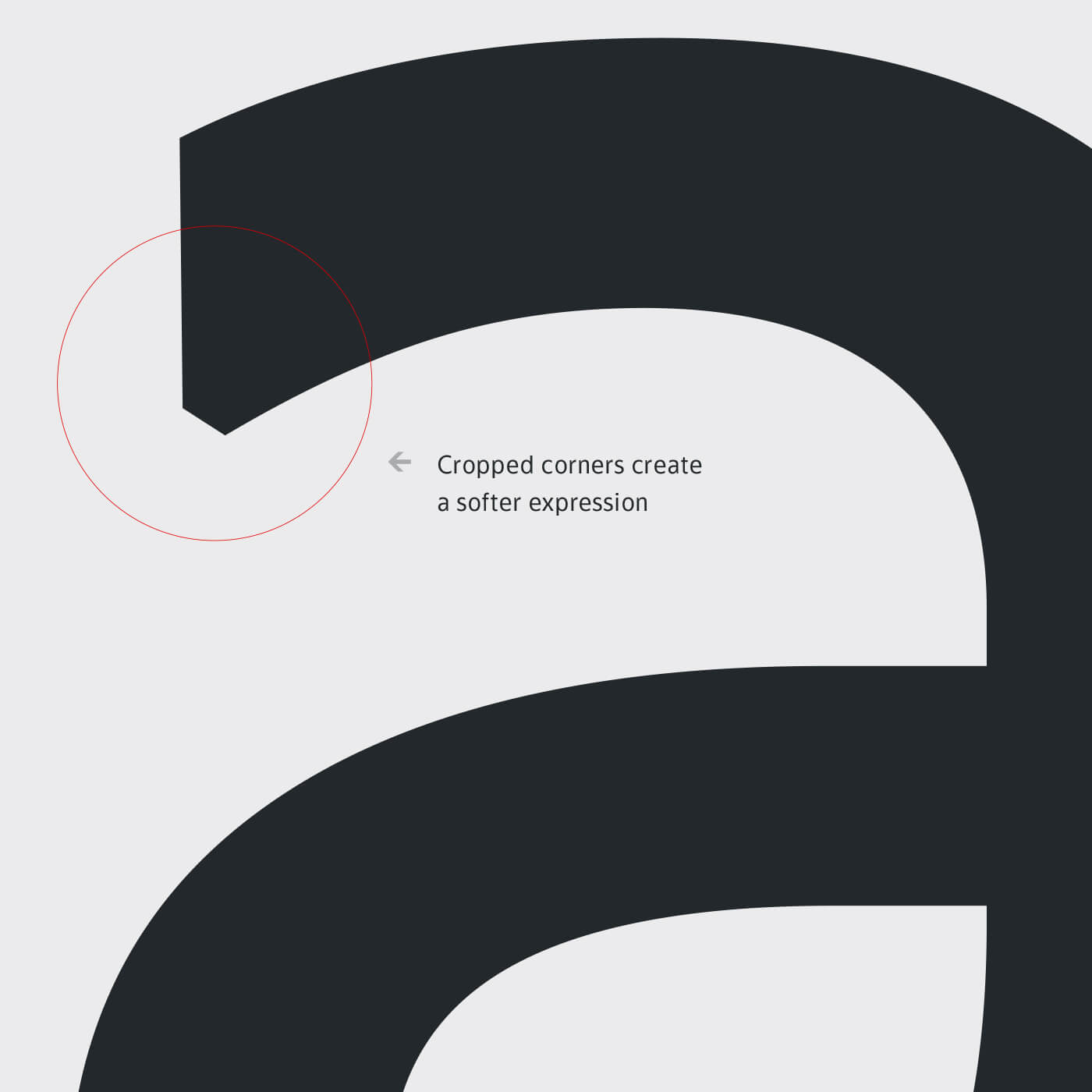
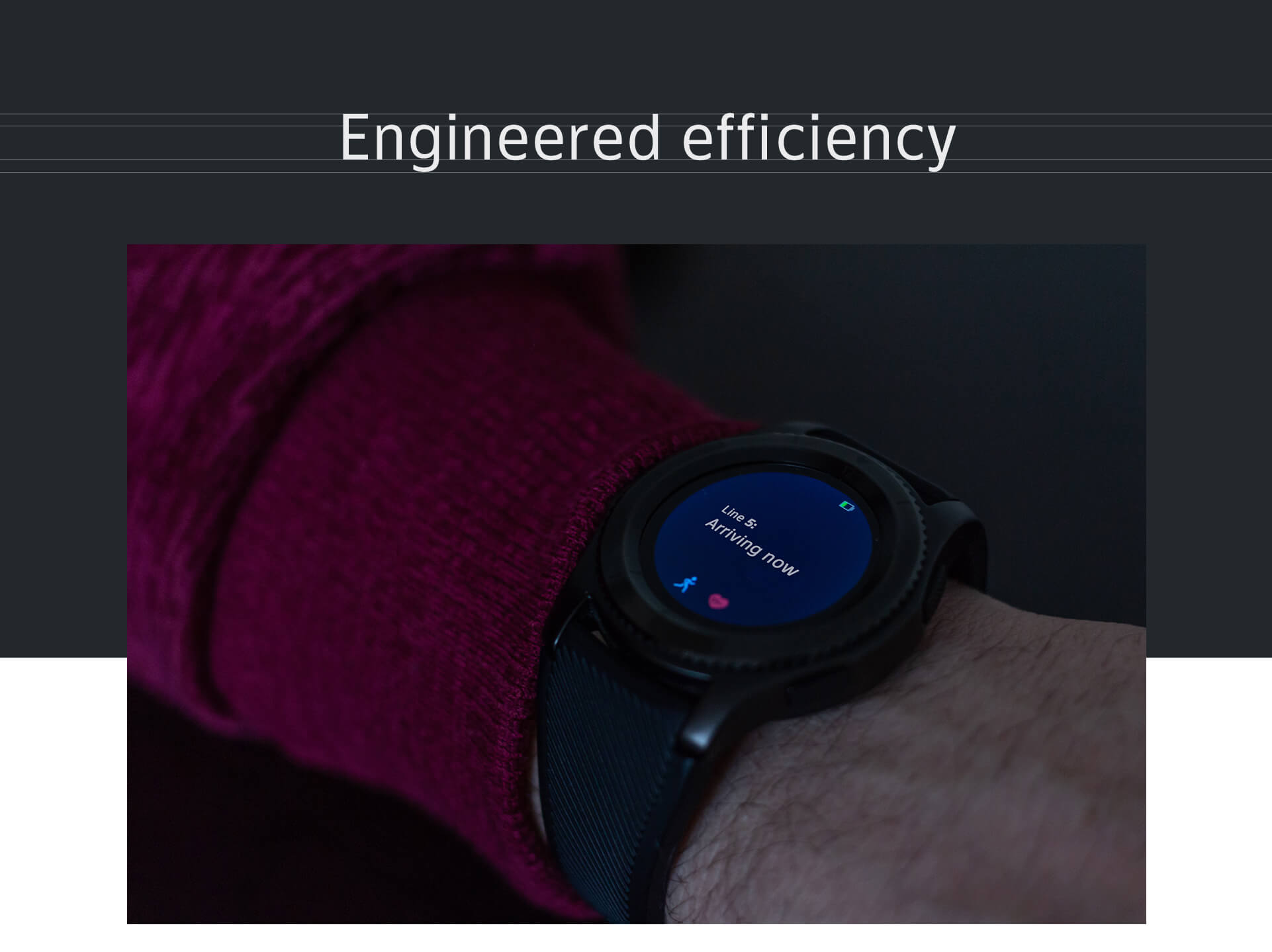
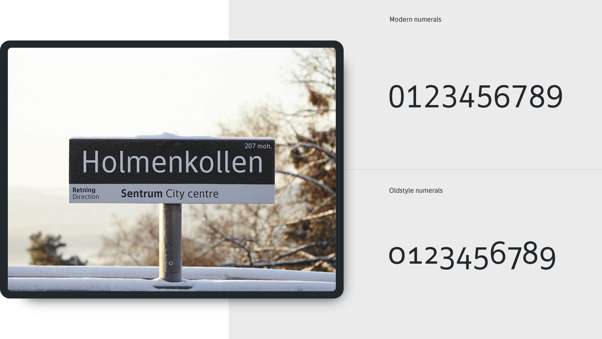
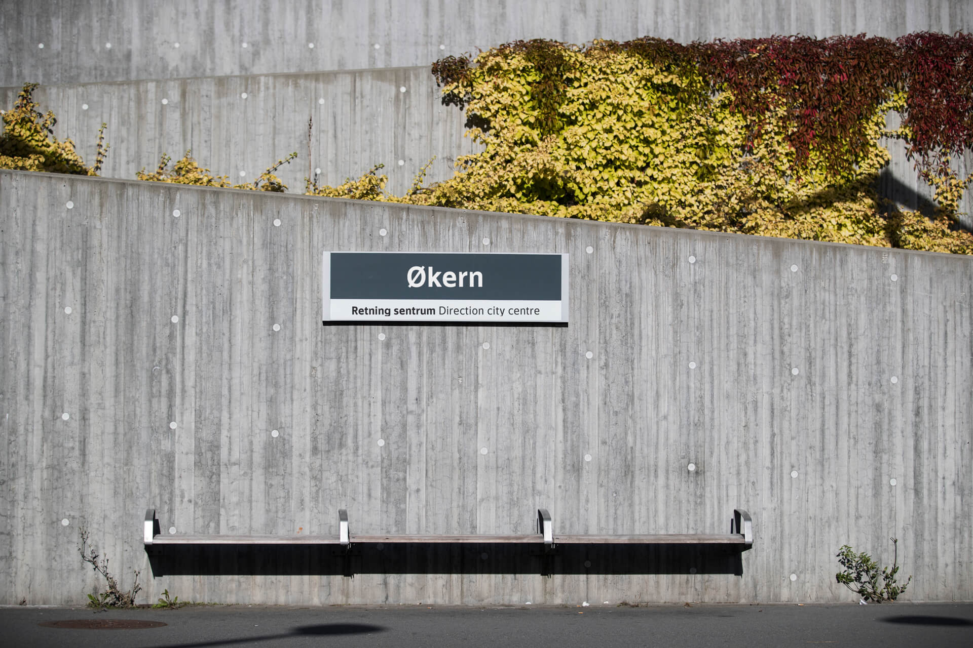
Designing the new Ruter typeface, called TID (Norwegian for ‘time’), readability and ease of use were key considerations. Ruter presents information to passengers in many different media – from print to digital screens, apps and webpages. The information is displayed in different sizes and quantities – from brief, large text on wayfinding to small numbers in timetables. Ruter also wanted a rounder and friendlier feel to their typeface to align it with their brand strategy. Stem developed this typeface in close collaboration with the client.