- Kund
- Ski NM Lygna
- Lösning
- Logo and profile
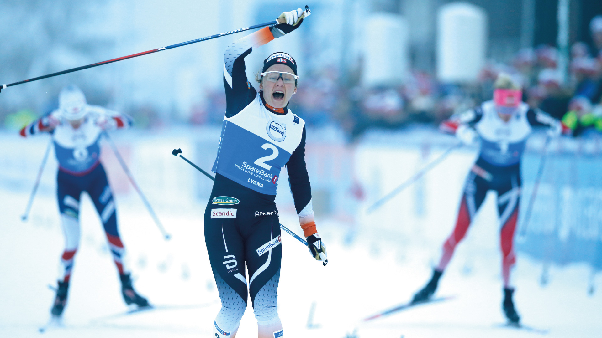
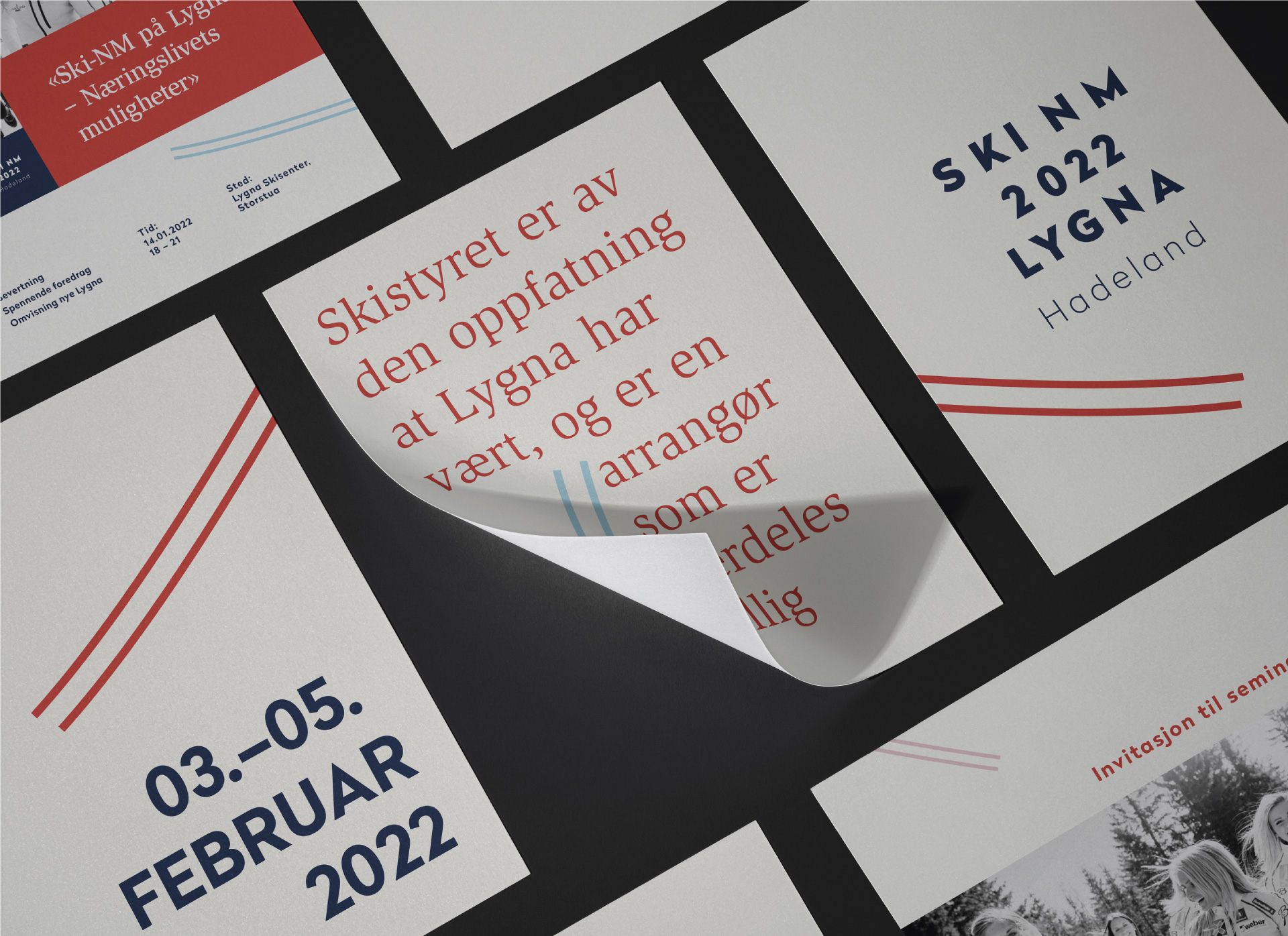
Lygna hosted the Norwegian Championships (Ski NM) in cross-country skiing for the first time in 2017, and again in 2019 and 2022. This is a massive festival, where we get to experience some of the biggest cross-country ski stars in action.
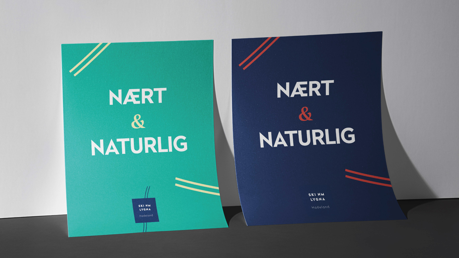
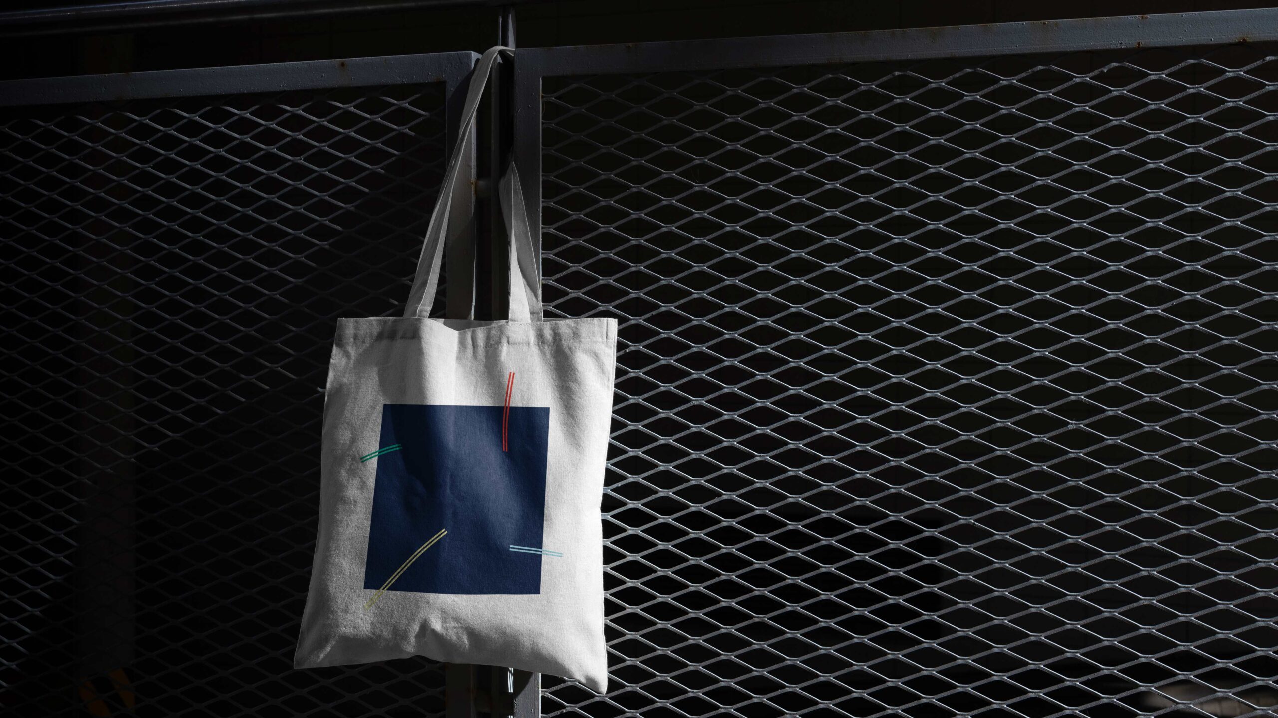
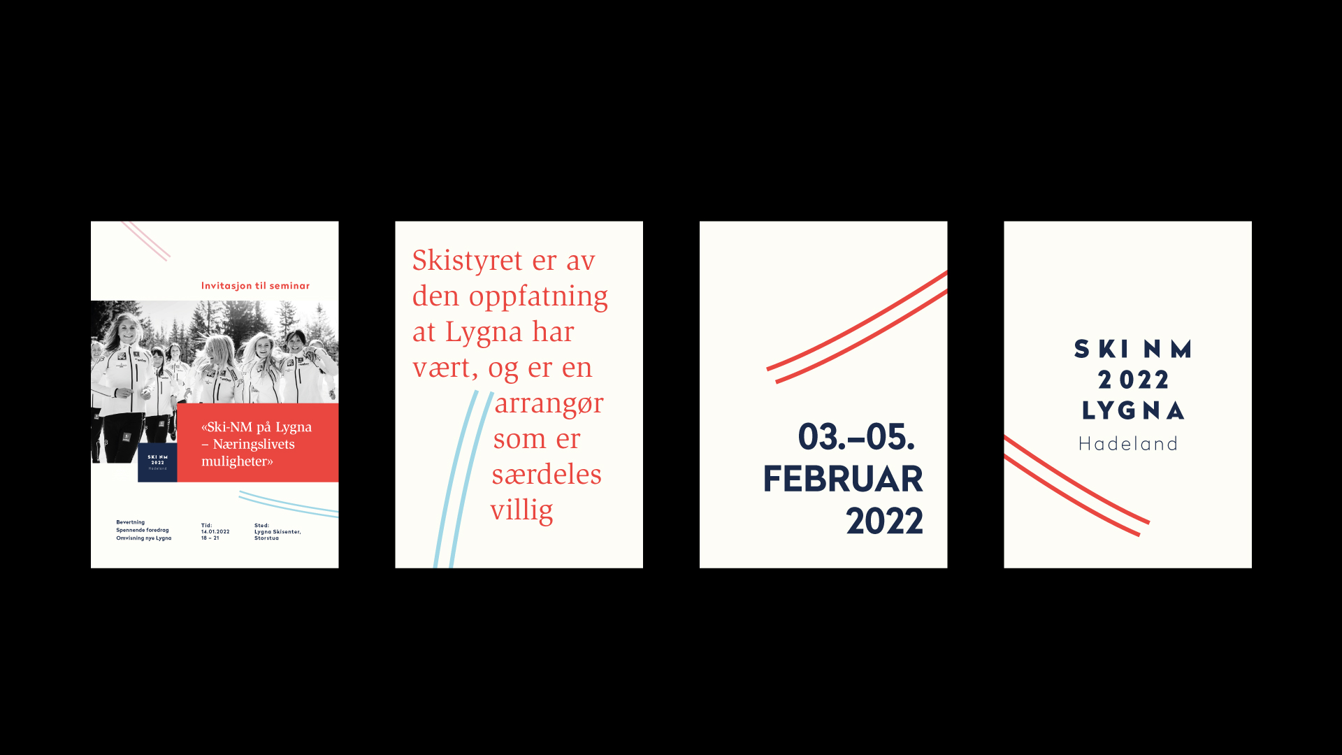
We have had the honor of creating the visual profile that combines the values of tradition, hard work, energy and breaking boundaries. The logo itself consists of two elements – a square where the event name is clearly displayed and a icon composed of lines forming the letters NM. The lines symbolize ski tracks, giving the impression of speed, energy and breaking boundaries. The colors are based on the Norwegian flag and create a nice contrast to the playful design.