- Client
- Wallenius Wilhelmsen
- Solution
- Brand strategy and identity design
The Wallenius Wilhelmsen group was created in April 2018, when Wallenius of Sweden and Wilhelmsen of Norway combined ownership of their jointly held logistics companies and relevant assets. This paved the way for a major rebrand of the Wallenius Wilhelmsen Group.
Over a year and a half, our team in close collaboration with the corporate communications department, executive team and CEO, to establish new internal and external strategies defining Wallenius Wilhelmsen’s position in the market and redefining WW employees’ relationship to their employer.
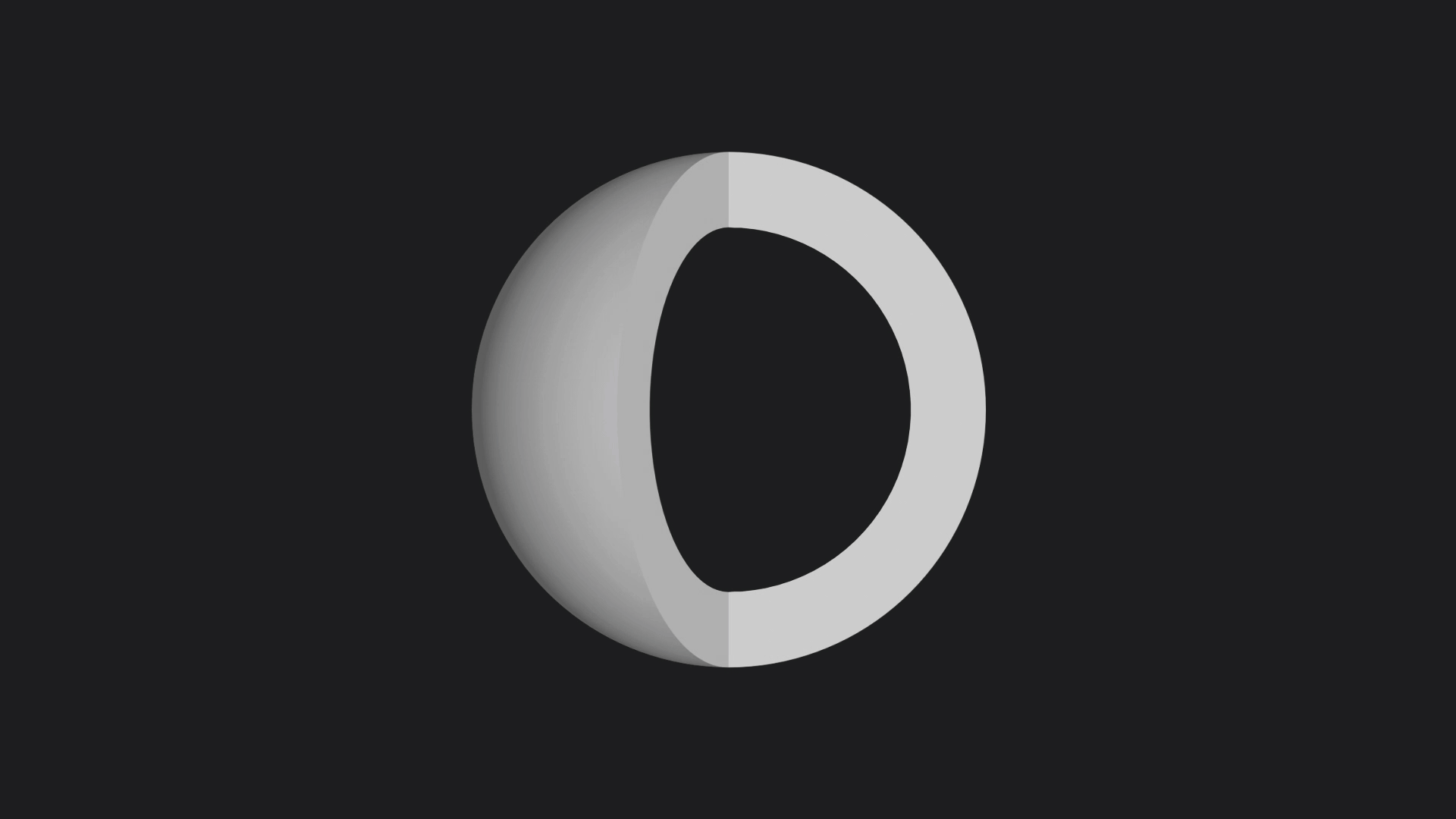
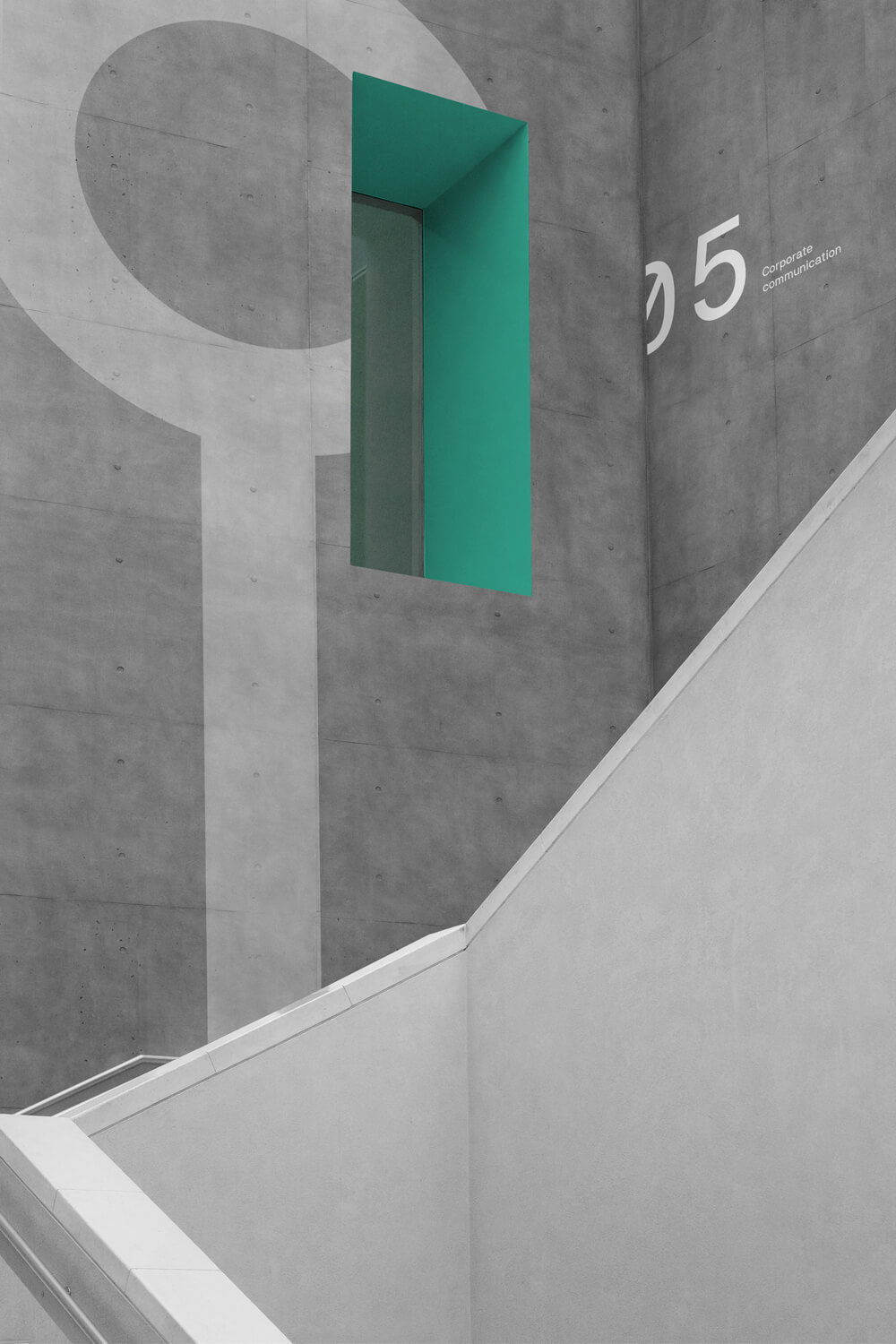
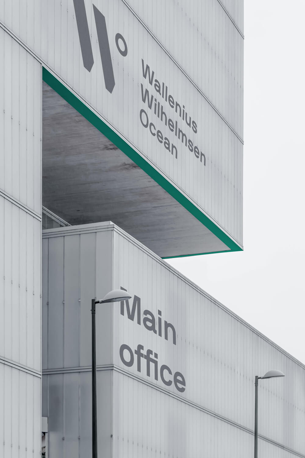
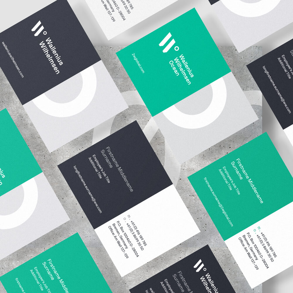
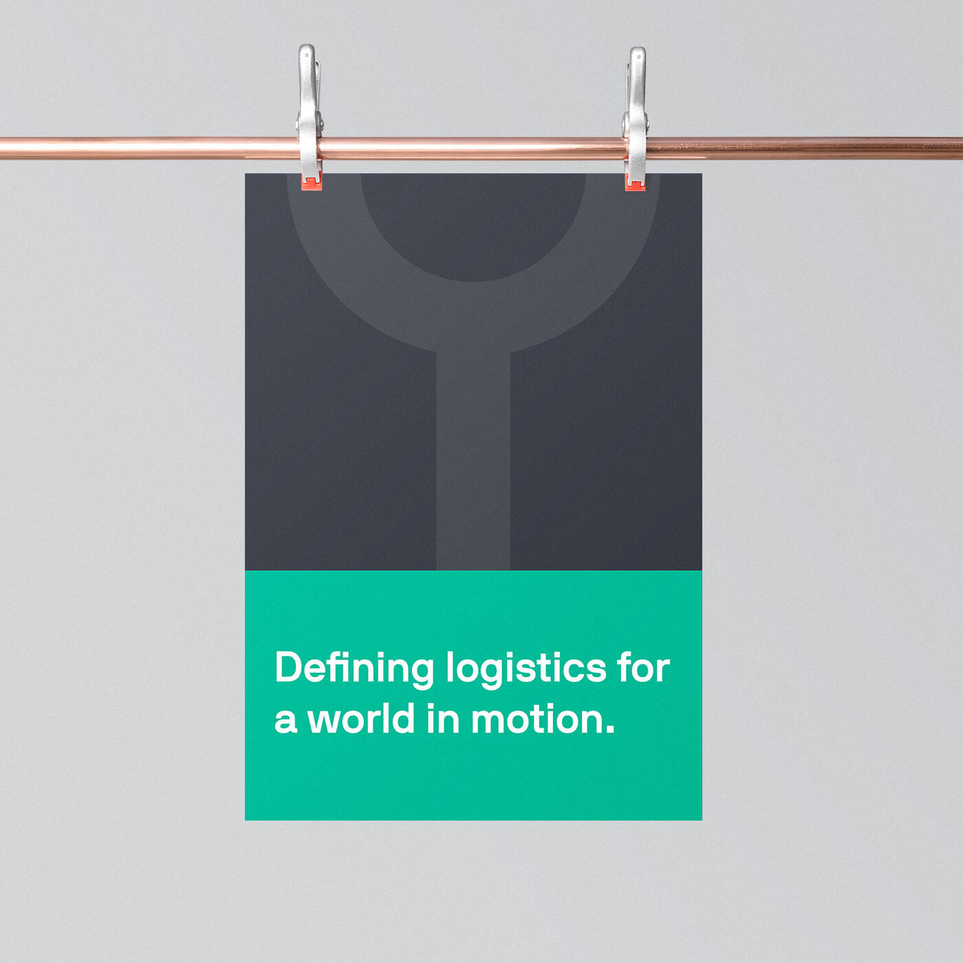
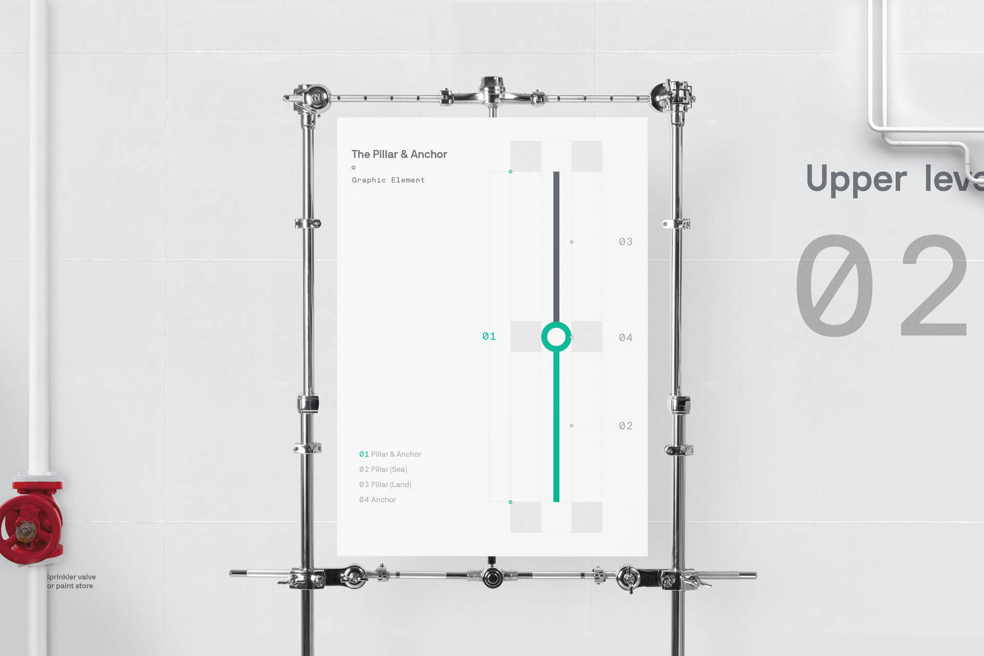
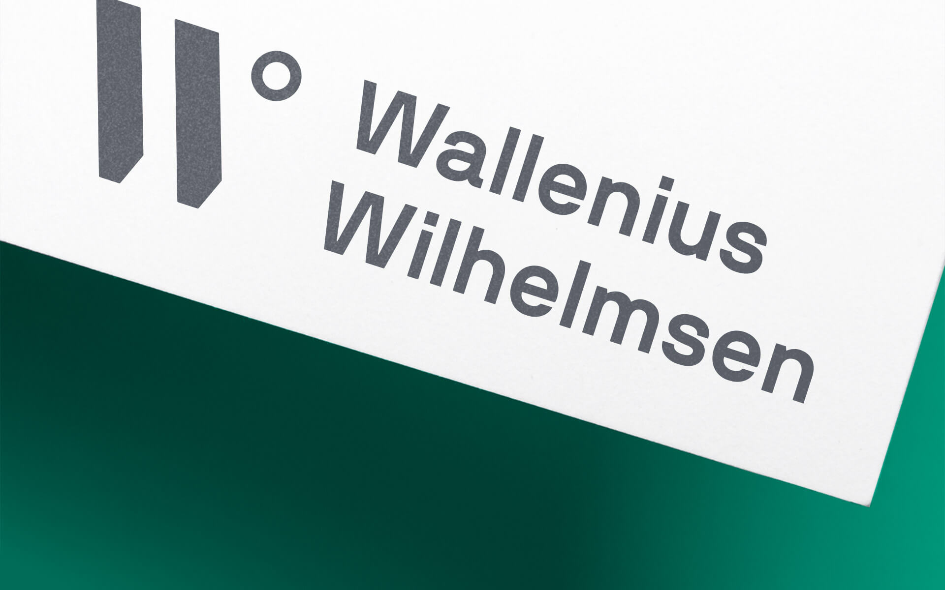
The new Wallenius Wilhelmsen logo is a modern take on the traditional W, made up of two lines and a circle. It incorporates the circle from the graphic element, which is used throughout the profile. It also evokes the degrees so prevalent in navigation, the sphere of the earth, as well as the life-cycle perspective.
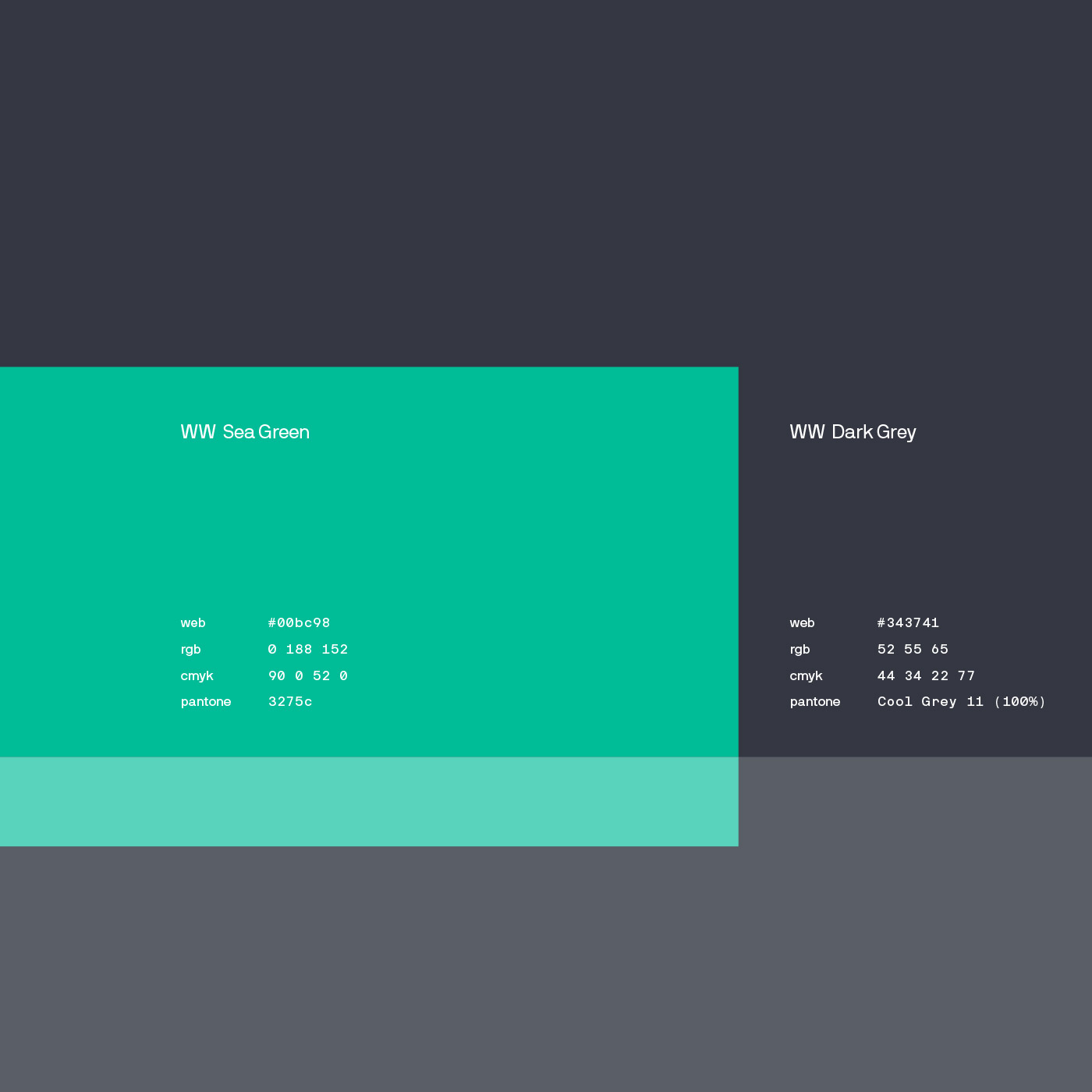
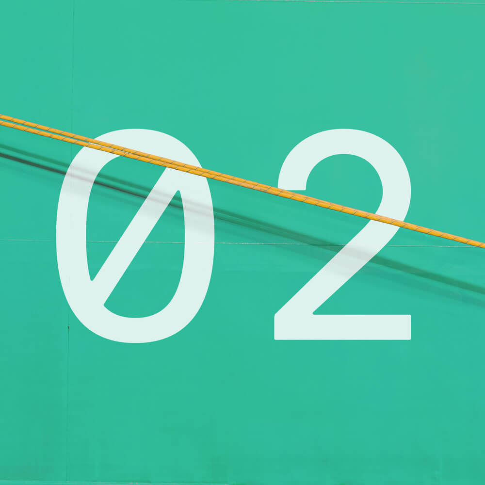
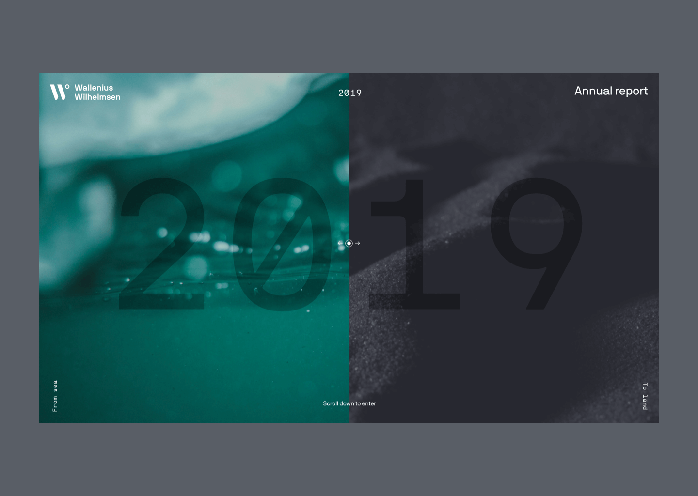
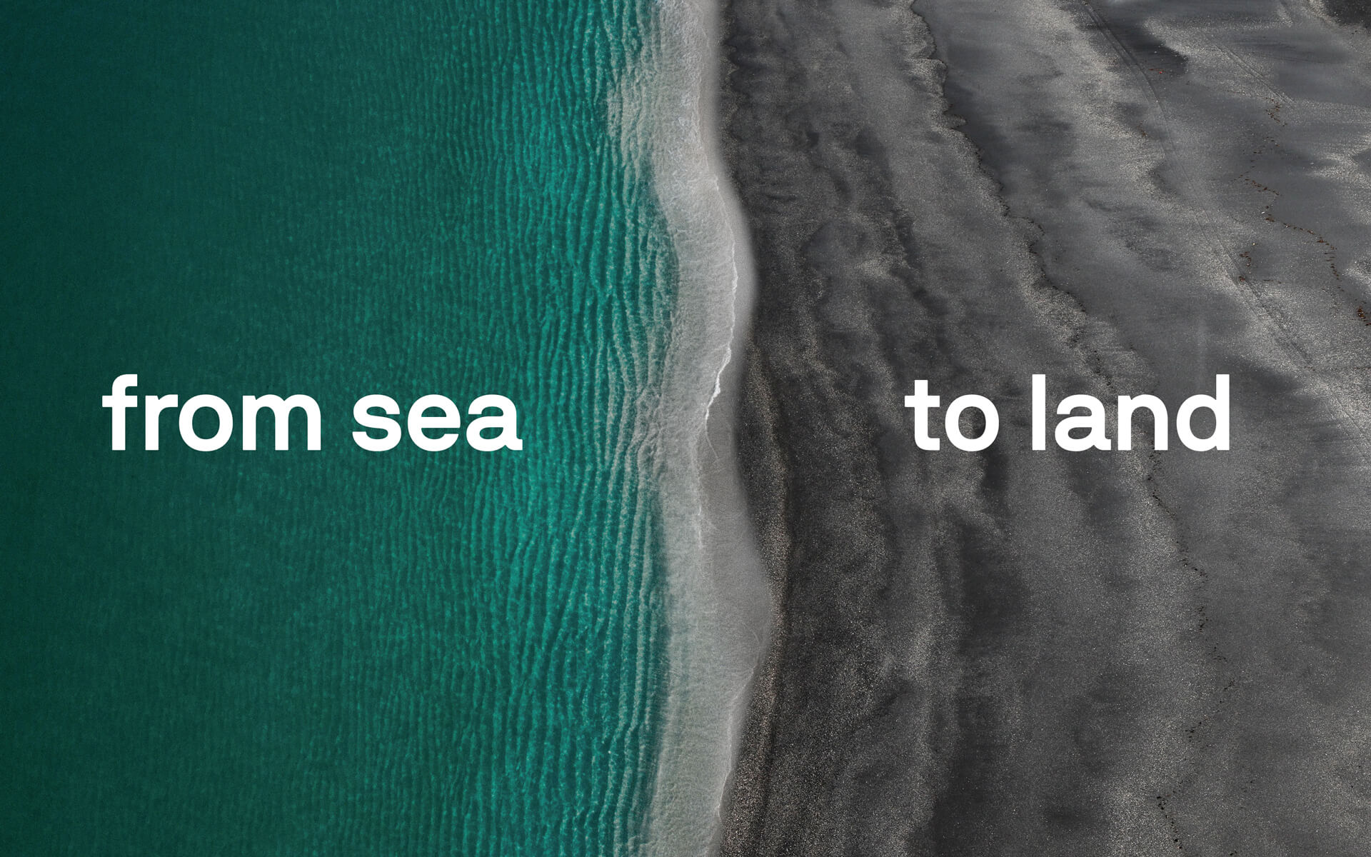
The two main colours aim to reinforce “sea to land”. A bold, bright sea green paired with a dark, stone gray create a balance of energy, stability and neutrality.
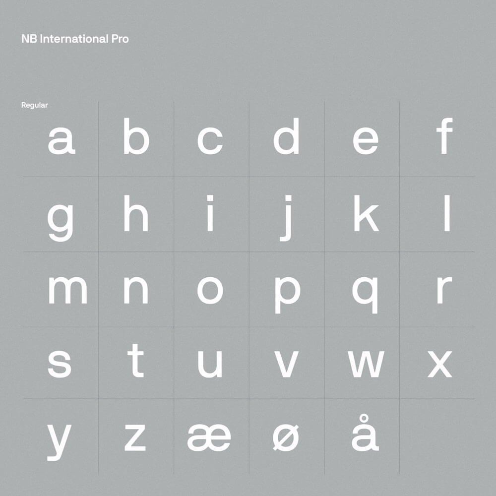
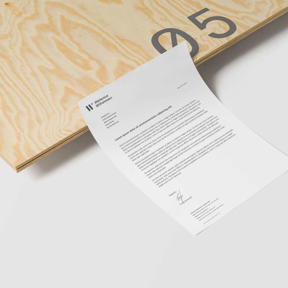
The typography for the new company had to cover several criteria. Not only should it be functional in its language support, but it also had to be both timeless and unique. In addition, we created a graphic element that is positioned as a “pillar & anchor” for all the Wallenius Wilhelmsen companies.