Work

Maritim pensjonskasse

Client
Maritim pensjonskasse
Solution
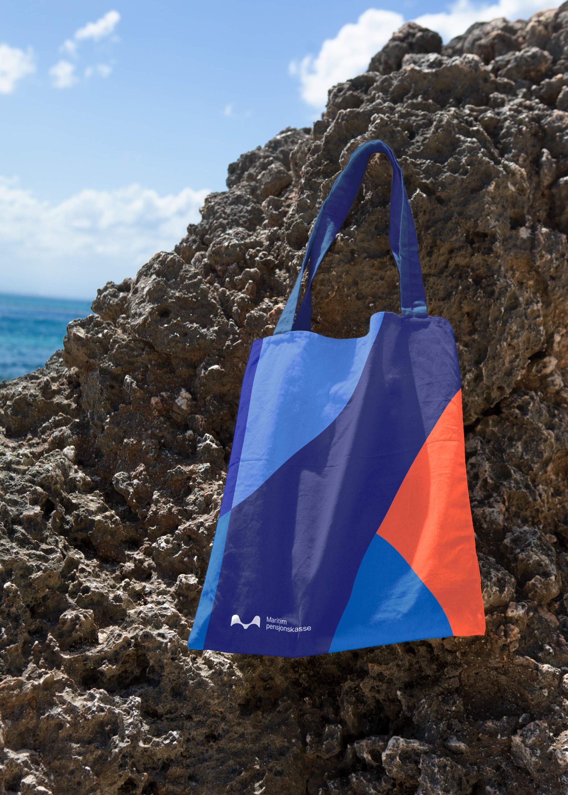
Dynamic and expressive identity for Maritim pensjonskasse

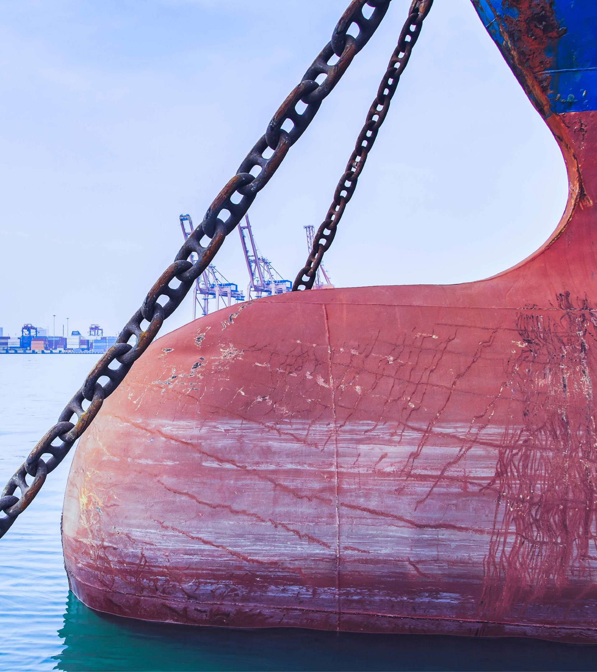
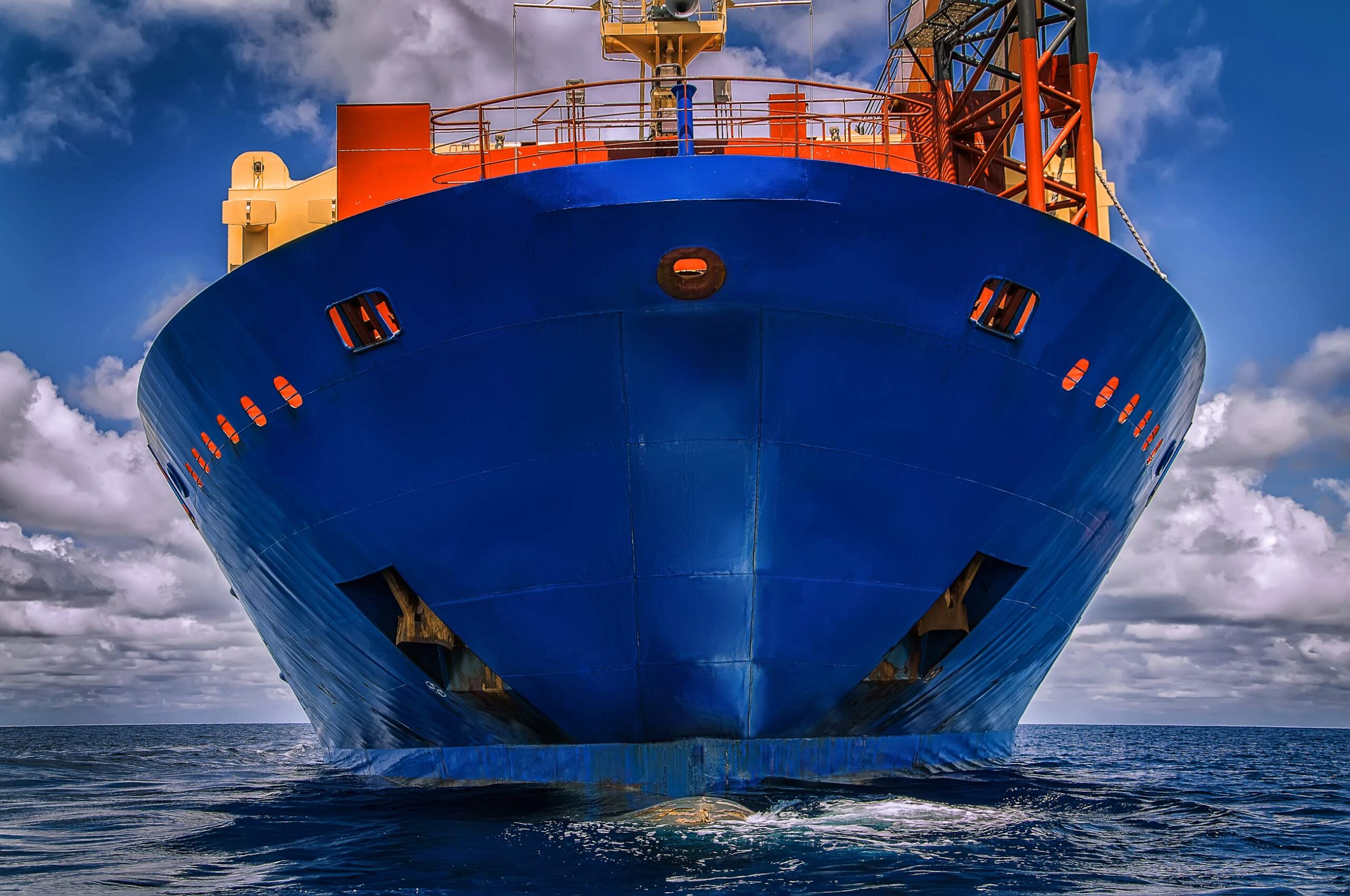
Maritim pensjonskasse (MPK) is a statutory pension scheme for workers at sea with members within traditional shipping and offshore also consisting of engineers and specialists.

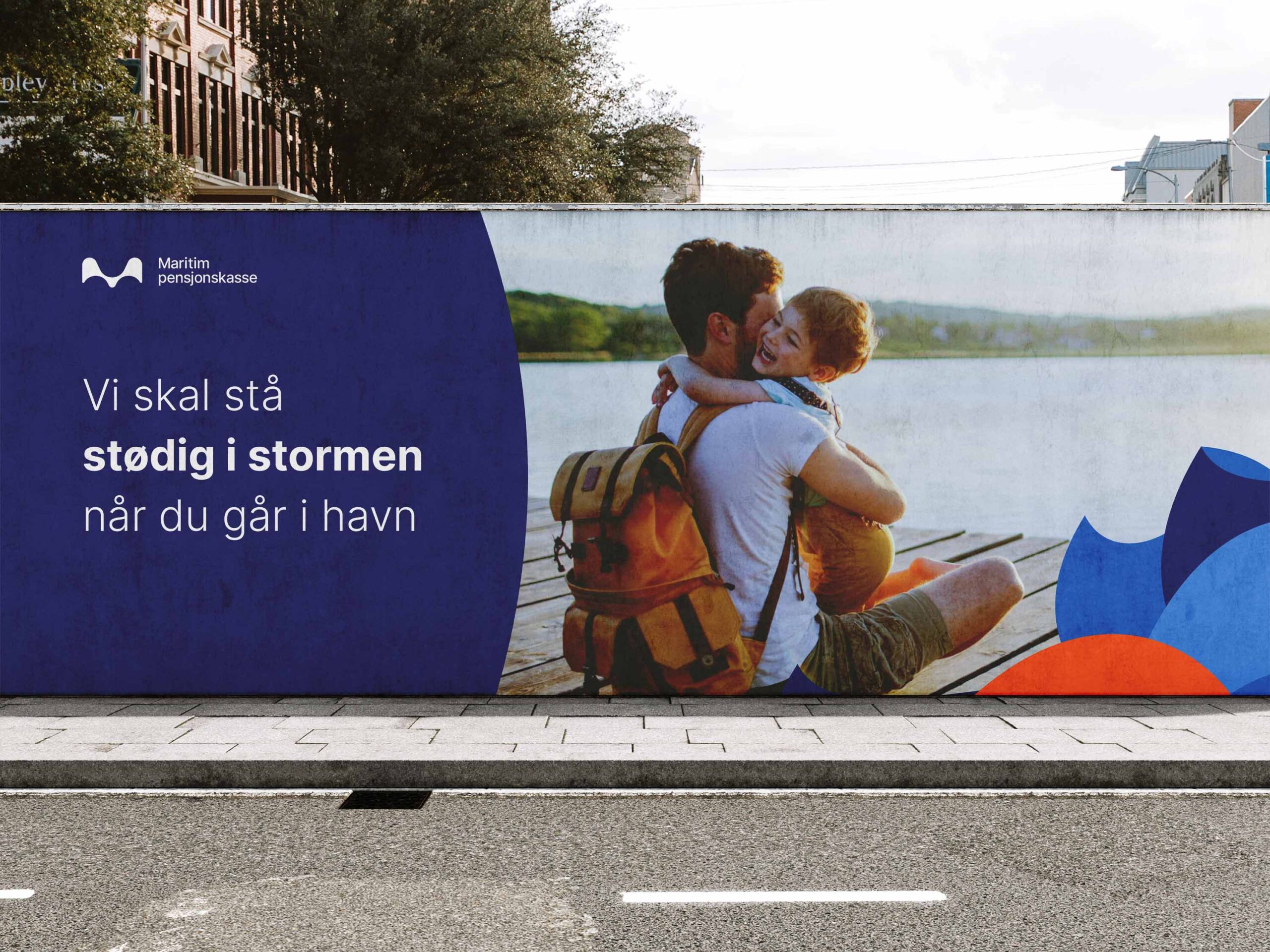
Everyone who works offshore has to deal with the unpredictable weather and extreme conditions of the sea. These are people who work through storms and unpredictability, and who need a steady and secure pension agreement they can rely on.

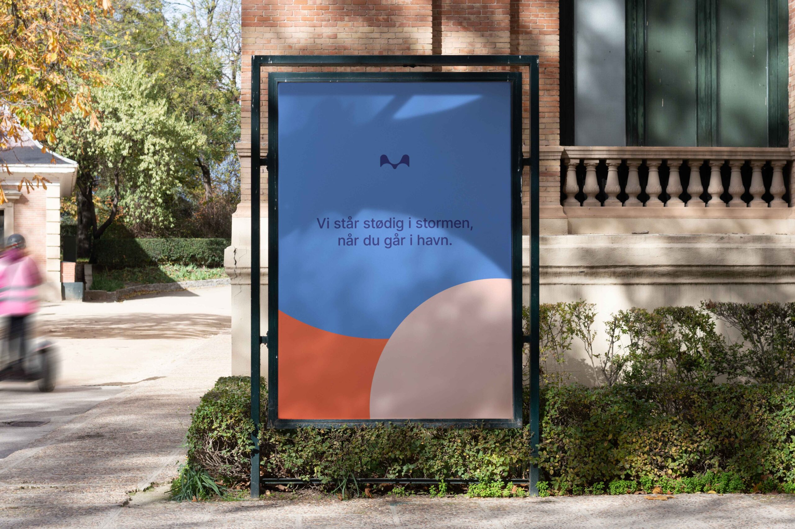
Maritim Pensjonskasse stands firm in the storm when you go ashore.

To visualize this message, we have used an abstract illustration style of storms and weather, which creates a dynamic and expressive design where Maritim Pensjonskasse is easily recognisable. The pattern we have developed can be used in many ways and adapted to all surfaces.

The logo is inspired by the movement of the sea and what you can find at sea. It represents waves shaped like an M, but can also be a seagull or a buoy. It embraces life at sea.

We wanted Maritim Pensjonskasse to be easy to recognise, even without a logo.
With the new illustration style and color profile, it is easy to create recognisability.

The color profile consists of several shades of blue that represent the sea together with the strong Sou’wester inspired orange color that represents the man in the storm. This creates space for mobility in the design, recognizability of the profile and dynamic use in many different ways.

We have developed an expressive and contemporary design that will strengthen the position of Maritim Pensjonskasse by being clear, representative of the target group and recognisable.